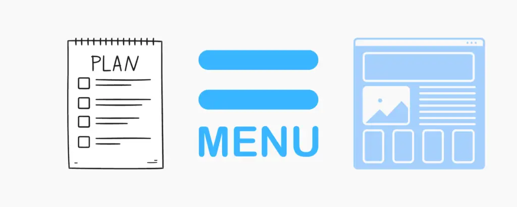
Planning Your Pages
In our previous lesson we looked at each of our main competitors and gave their sites an audit, now we have gained valuable insights we need to harness this knowledge and use it to create our own website.
We will now look at creating an effective navigation menu by thinking about which pages we should include on our website – these pages not only have to captivate our audience but also seamlessly guide them through our content.
Let’s turn competitive intelligence into a strategic advantage by giving our readers the experience that they are after.
What Pages Should Your Website Have?
The specific pages your website should have can vary depending on the purpose and content of your site, here at the TWK our navigation bar is pretty simple but other sites have many categories – here are some common pages that many websites include:
Homepage: This is the main landing page of your website and typically provides an overview of what your site is about and directs visitors to other important sections.
About Us/About Me: This page provides information about your company, organization, or yourself. It’s a place to share your mission, history, and team members.
Contact Us: This page includes contact information, such as an email address, phone number, and possibly a contact form. It makes it easy for visitors to get in touch with you
Products/Services: If you’re selling products or offering services, you should have dedicated pages for each category or individual items/services. Include descriptions, prices, and images.
Portfolio/Projects: If you’re in a creative field, a portfolio showcases your work. For businesses, a projects or case studies page can demonstrate your expertis.
Blog/News: If you plan to create regular content, a blog/news section is essential. It’s a place to publish articles, updates, and news related to your niche.
Testimonials/Reviews: Customer feedback can build trust. Share testimonials or reviews from satisfied clients or customers.
FAQs: Frequently Asked Questions can help address common queries and reduce the burden on your support team.
Privacy Policy: This page outlines how you collect, use, and protect user data. It’s often legally required.
Terms of Service: This page lays out the terms and conditions users agree to when using your site or purchasing products/services.
Disclaimer: If your website provides information or advice, a disclaimer can help protect you from legal liabilities.
Search/Archive: As your website grows, make it easy for visitors to find specific content through a search feature or archives
Sitemap: A sitemap is a visual representation of your website’s structure, which can help both users and search engines navigate your site.
Subscribe/Newsletter: If you plan to send updates or newsletters, include a subscription form.
Social Media Links: Links to your social media profiles can help visitors connect with you on other platforms.
404 Page: A custom 404 error page can guide users when they land on a broken or non-existent URL.
Login/Account: If your site requires user accounts, provide a login or registration page.
Events/Calendar: If you host events or have a schedule of activities, an events or calendar page can be helpful.
Resource Center: Offer valuable resources like ebooks, whitepapers, templates, or other downloadable content.
Legal Pages: Depending on your location and website type, you may need other legal pages like a cookie policy, GDPR compliance, or accessibility statement.
Planning Your Navigation Menu
Designing a good navigation bar for your website is essential for providing an intuitive and user-friendly browsing experience. Here are some key principles and tips for creating an effective navigation bar:
Simplicity and Clarity:
Write down the words of the pages that you think you need to include within your website.
- Keep it simple and straightforward. Avoid clutter and excessive links.
- Use clear and concise wording for menu items.
- Use familiar navigation terms like “Home,” “About,” “Services,” “Contact,” etc.
Hierarchy:
- Organize your navigation items in a hierarchical order. Place the most important and frequently accessed items at the top.
- Consider dropdown menus or submenus for organizing related content.
Limited Number of Items:
- Aim for around 5-7 top-level navigation items. Too many items can overwhelm users.
- Use secondary navigation menus or footer links for less important or additional content.
Visual Design:
- Make sure your navigation bar stands out visually.
- Use color, typography, or highlighting to differentiate it from the rest of the page.
- Use a consistent design style for your navigation links, such as buttons, text links, or icons.
Responsive Design:
- Ensure your navigation bar is responsive and adapts to different screen sizes (mobile devices, tablets, desktops).
- Consider using a “hamburger” menu icon for mobile devices to save space.
Whitespace:
- Provide enough whitespace around each navigation item to improve readability and clickability.
- Ensure there’s enough space between the items to prevent accidental clicks.
Highlight the Current Page:
- Make it clear which page the user is currently on by highlighting or changing the appearance of the corresponding navigation item.
Consistent Placement:
- Keep the navigation bar in a consistent location throughout your website.
- The top of the page or the side (for vertical navigation) are common choices.
- Avoid moving the navigation bar to different positions on different pages.
Descriptive Labels:
Use descriptive labels that accurately represent the content users will find when clicking on a menu item.
Testing and User Feedback:
- Conduct usability testing to gather feedback on your navigation. Observe how users interact with it and make improvements based on their feedback.
- Analyze user behavior through tools like Google Analytics to identify navigation issues and optimize accordingly.
Search Bar:
- Include a search bar in your navigation if your site has a lot of content. This allows users to find specific information quickly.
Call to Action (CTA):
- Consider adding a prominent CTA button in your navigation for actions like “Sign Up,” “Request a Quote,” or “Shop Now.”
Accessibility:
- Ensure your navigation is accessible to all users, including those with disabilities. Use proper HTML markup, ARIA roles, and test with screen readers.
Loading Speed:
- Optimize your navigation bar for fast loading times. Heavy images or scripts can slow down navigation responsiveness.
Regular Maintenance:
- Periodically review and update your navigation as your website evolves. Remove outdated links and add new ones as necessary.
Seas of Solitude Navigation Bar
Here is the design for the ‘Seas of Solitude’ navigation bar. (the bold text are the primary categories, then the second tier categories and lastly the third tier categories.
Home.
About.
Destinations.
Africa
Asia
North America
South America
Central America
Europe
France
England
Italy
Oceania
Luxury Travel.
Share Your Story.
Blog.
Contact.
FAQ’s
(these will be found in the footer)
Sitemap.
Privacy Policy.
Terms of Service.
Disclaimer.
(Links to social media)
Instagram
This example shows 22 pages – the ‘Destinations’ section of this blog will be the one that expands out covering more and more countries, also the ‘Share Your Story’ section will increase as the community builds.
Creating Our Pages.
Let’s now jump into WordPress and create all our pages that we think we are going to need to get started.
In the video below you will see me create a web page in it’s most basic form – we’ll add content to it in the next few lessons.
I will create the first block of 18 pages listed above from Home-FAQ’s.
Conclusion.
I hope you found this particular lesson informative and have now successfully planned out the pages of your website.
In the next lesson we will hop back into WordPress and start designing our Homepage 🙂
See you there!